Vor 2 Jahren habe ich mir als Gaming-PC eine Alienware Alpha angeschafft. Endlich habe ich mal ein Review des Gerätes gemacht und dazu einen Bericht geschrieben.
Kurzzusammenfassung: für mich top!
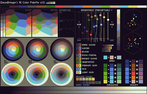
Da Forumposts ab und an verschwinden und ich diesen Zusammenhang für sehr interessant befinde, eine Kopie hier in mein Blog von DawnBringer bei pixeljoint.com:
“So, dear friends, I have wasted some time lately with my obsession for
palettes. It’s been tackled before but I felt there was (and is?) more
work to be done with designing a great multi-purpose 16 color palette
(I’ll avoid any talk of “perfect” or “ultimate” as there simply isn’t
such a thing for a limited palette).
Property wish-list:
* Archetypical colors common in games/pixelart
* Real world colors (RGB-space brightness-axis “colorcigarr”)
* Good coverage of the spectrum
* Great coverage of the brightness range (a must for any useful palette)
* Max combinatory possibilities: Interpolations, simulations, dithers etc.
* …and if possible; colors that may work as subtle varitations: rust, dirt, textures.
But as with all small palettes, some things had to be sacrificed: This
palette is very weak in magentas (as that is a rarely used area). It
also lack much in turquoise – but at least they can be simulated by
combining the many blues & greens.
This is public version 1.0 (v9843.7 to me )
DawnBringer’s 16 Col Palette v1.0
Some notes:
* The dark register is dominated by blue/violett commonly found in shadows/dark waters etc.
* The lower-medium register has the weight on green and browns; found in vegetation, wood etc.
* The upper-medium register has much blues and orange/pink to handle skies, sand and skin.
* The bright register has the lone yellow and the effective pink &
cyan that are complimentary colors that span around the spectrum and
can be mixed to a very good grey!
* Red is slightly violett – I wanted a red that contrasted the other
colors rather than being another shade of brown/orange. Still good
enough to use in some skin-shades I hope.
— Mockups omitted —-
Outstanding issues:
* The optimal(?) global brightness/contrast level…these can be
adjusted quite easily without affecting the internal relationships of
the colors very much – so if you have any feelings about this lemme
know.
* The dark register: is there a better combination/structure of colors here?
 )
)